
Theme blocks
The theme blocks put Croissant Pay in your cart and cart drawer, and work on every Shopify plan — Shopify Plus is not required. You position them yourself with CSS selectors, which is the real, per-store work in this integration.
Enabling the blocks
None of this happens automatically. A fresh install, and every new or duplicated theme, starts with the embeds off.
- Go to Online Store → Themes and click Edit theme on the exact theme you will test or publish.
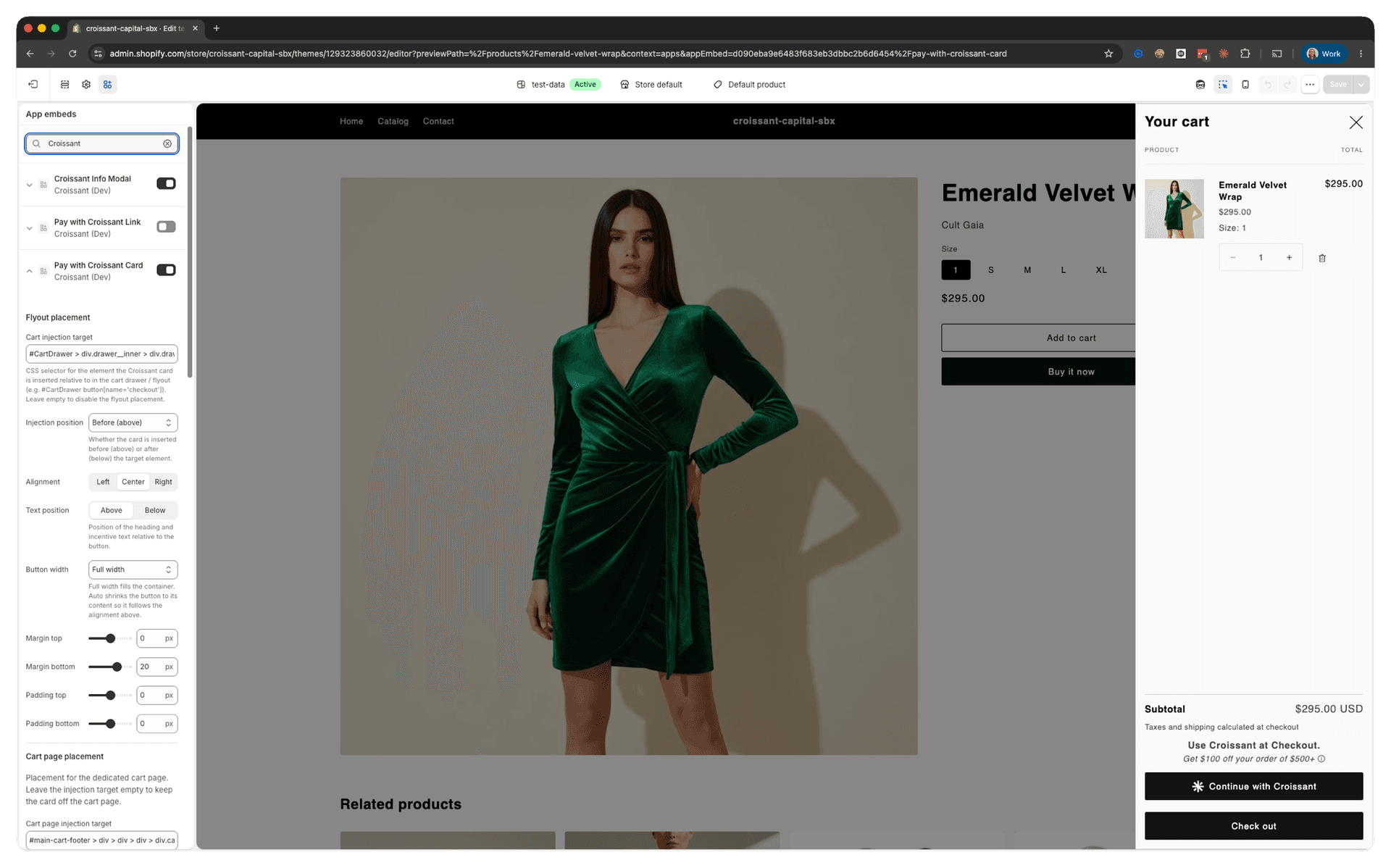
- Open App embeds in the theme editor and search for Croissant.
- Enable Croissant Info Modal and either Pay with Croissant Card or Pay with Croissant Link. Enable both CTA blocks only if you intentionally configured different surfaces for them.
- Select each enabled embed to configure its placement and appearance. Add an item and open the cart drawer so the preview shows the surface you are targeting.
- Click Save, then verify the published storefront — not only the editor preview.
| Block | Use it for |
|---|---|
| Pay with Croissant Card | The primary CTA — heading, offer line, info icon, and Continue with Croissant button. Full button styling controls |
| Pay with Croissant Link | A lighter inline text link for tight carts. Five copy variants (short, medium, long, minimal, save) and link styling instead of button styling. minimal renders Checkout with Croissant; custom link text is also supported |
| Croissant Info Modal | The shared explainer dialog. Carries one setting, the same steps / covers layout choice |
Choosing surfaces
| Surface | Where |
|---|---|
| Cart drawer / flyout block | Your mini-cart or slide-out cart |
| Cart page block | The dedicated /cart page |
Injection selectors
Each block configures the cart drawer and the cart page independently. Leaving a target empty disables that surface, so you can run the drawer only, the cart page only, or both. With no target on either, the block does nothing at all.
| Setting | Purpose |
|---|---|
| Cart injection target | Selector in your cart drawer to inject relative to. Defaults to button[name='checkout'] |
| Cart page injection target | Same, for /cart. Empty by default — set it to enable the cart page |
| Injection position | before (above) or after (below) the target. Defaults to before on the Card block and after on the Link block |
| Alignment | Left, center, or right |
| Text position | Heading and offer copy above or below the button (Card only) |
| Button width | Full width, or auto — auto shrinks to content so it follows the alignment above (Card only) |
| Margin / padding top and bottom | −48px to 48px each. Negative values close gaps left by theme spacing |
| Cart drawer close button | Selector for your drawer's close control. Croissant clicks it before opening the info modal, so the modal is not trapped behind the drawer. Leave it empty and Croissant falls back to matching common drawer patterns — set it if the modal opens behind your drawer |
Good targets are the checkout button or the container holding your cart CTAs:
/* Dawn and most Dawn-derived themes */
button[name='checkout']

/* Scope to the drawer when the same selector exists on the cart page */
#CartDrawer button[name='checkout']

/* Inject above a CTA group rather than a single button */
.cart__ctas

/* Themes with an id on the checkout button */
#checkout-buttonTo confirm the block received the settings you think it did, dump them straight off the template element it reads them from:
console.table(
  document.getElementById("croissant-pay-card-template").dataset
);
Behavior you should not fight
- The block restores itself. If your theme tears down and rebuilds the cart — closing and reopening a drawer, or changing a line quantity — the button comes back on its own. You do not need to re-mount or re-initialize anything.
- One page reload after authorizing. On non-Plus plans the cart reloads once when an authorization is applied, so the shopper sees discounted totals instead of the pre-discount ones the page was rendered with. It is expected. Do not suppress it, and do not route the cart through client-side navigation that swallows it.
- Cart data. The block stores data on the cart that the integration depends on. Custom cart code that rebuilds the cart from its own state and drops attributes will break checkout — see Discounts and cart data.
Cart states on non-Plus plans
Because the cart is the whole flow on Basic, Grow, and Advanced, the cart block replaces itself with the authorized UI rather than staying a CTA:
| State | What the shopper sees |
|---|---|
| Authorized | Croissant Payment Authorized, the credit back they earn, and Remove Croissant |
| Cart changed | Your cart changed, with Reauthorize with Croissant and Remove Croissant |
Remove Croissant cancels the authorization and releases the card hold. It is also the fastest way to reset yourself while testing. On Plus, none of this appears on the cart — the checkout block handles the authorized experience.
The Link block renders the same two states with shorter copy — Croissant authorized / Cart changed, and Remove in place of Remove Croissant — so it stays on one line in a tight cart.
Matching your theme
Rather than a full style editor, the blocks mirror an existing element in your theme. Point Button style source (Card) or Link style source (Link) at something whose look you want, and Croissant copies its classes onto the Croissant CTA — inheriting your fonts, radii, hover states, and colors with no CSS on your side.
/* Button style source — mirror the theme's primary cart button */
button[name='checkout']

/* Button custom classes — or add your own utility classes */
btn btn--primary btn--full-width
Fine-tuning is there for what mirroring cannot cover:
- Logo (Card) — hide it, or size it from 12px to 48px. Defaults to 22px.
- Text overrides — font size, line height, and letter spacing for the heading and offer copy. Default to
inherit, which is usually correct. - Button overrides (Card) — height, horizontal and vertical padding, font size, line height, and letter spacing.
- Link overrides (Link) — font size, line height, and letter spacing only. No height or padding, since the link is inline text.
- Custom link text (Link) — optional free text that replaces the selected copy variant. Leave it blank to keep variant-driven copy and preserve the default behavior.
- Button/text gap (Card) — extra space between the button and the offer copy, whichever side the copy is on. This is not the gap between the logo and the label, which is fixed.
- Internal gap (Link) — vertical space between the offer copy and the link inside the component.
- Label vertical offset (Card) — nudges the label up or down, −8px to 8px. Only for a brand font that sits visibly off-center in the button.
- Hide info icon (Card only) — removes the explainer affordance. The Link block has no such setting; hide it with CSS if you need to.
Styling is shared across the drawer and the cart page; placement is not. That is deliberate — the button should look identical everywhere and sit differently. If you do need the two surfaces to look different, CSS scoped to [data-croissant-surface] is the way, and Customizing and styling covers it along with every setting above in full.