
Checkout block
The checkout block is the Croissant surface inside Shopify checkout. It requires Shopify Plus — Plus is the only plan Shopify allows apps to add UI to checkout on. On Plus, it is also the surface that applies the discounts, so treat adding it as required, not optional.
Adding it
- Go to Settings → Checkout and click Customize on the checkout profile used by your store.
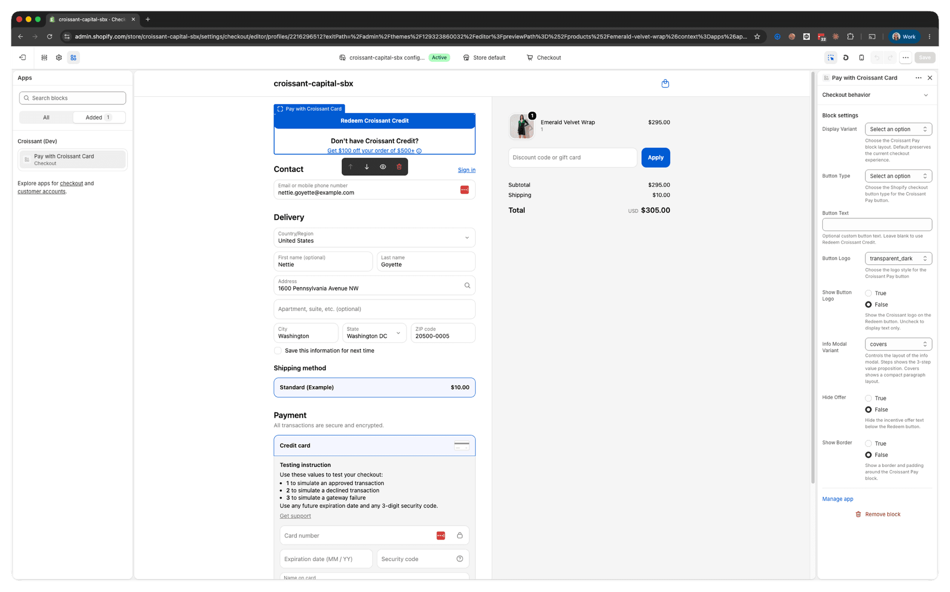
- In the checkout editor, choose Add app block and add Pay with Croissant Card. It defaults to the first wallet position.
- Drag the block to the intended position, select it to open its settings, and click Save.
- Test the checkout profile assigned to the storefront. Editing an inactive draft profile does not change the buyer experience.
States
It renders four states, with no work on your part:
- Default — the Croissant button, with offer copy beneath it when the shopper qualifies.
- Authorized — a confirmation banner with the credit back. When a balance is still due after the Croissant discounts, it instead prompts the shopper to reauthorize for more credit, which is also what they see if they edited the cart after authorizing.
- Gift card applied — an explanatory notice instead of the button.
- Hidden — while loading or voiding, outside USD, or when the integration is not live.
Settings
The checkout editor shows these fields empty, not pre-filled. Empty means the default in the last column.
| Setting | Options | Default |
|---|---|---|
| Display Variant | default (full block), simple_button (button only) | default |
| Button Type | primary, secondary, plain — Shopify's native checkout button styles | primary |
| Button Text | Free text | Redeem Croissant Credit |
| Supporting Link Text | Optional free text shown below the button. The link and adjacent info icon open the Croissant explainer modal | empty — hidden |
| Button Logo | filled_dark, filled_light, transparent_light, transparent_dark | filled_dark |
| Show Button Logo | Boolean — off gives a text-only button | On |
| Info Modal Variant | steps (3-step explainer), covers (compact paragraph) | steps |
| Hide Offer | Boolean — suppresses the incentive line | Off |
| Show Offer in Info Modal | Boolean — shows the welcome offer at the top of the info modal | Off |
| Show Border | Boolean — border, background, and padding around the block | On |
The editor shows the fields empty, so the effective configuration of a freshly placed block is:
{
  "display_variant": "default",
  "button_kind": "primary",
  "button_text": "Redeem Croissant Credit",
  "supporting_link_text": "",
  "logo_style": "filled_dark",
  "show_logo": true,
  "info_modal_variant": "steps",
  "hide_offer": false,
  "show_modal_offer": false,
  "show_border": true
}
Two interactions between settings are worth knowing:
Hide Offerhides the default offer and its info icon. A configuredSupporting Link Textremains visible and keeps a route to the explainer modal.simple_buttonignoresShow Border. It renders only the button by default. ConfigureSupporting Link Textto add a link and info icon beneath it without restoring the full offer block.
Styling it
There is no CSS in checkout — Shopify renders app blocks in a sandboxed frame and no app can inject a stylesheet. The upside is that the Croissant button is a native Shopify checkout button, so your checkout brand settings already reach it. Button Type is how you make Croissant subordinate to your Pay now button. Anything beyond that has to be built into the extension — see Customizing and styling.